
This past week has been a whirlwind of focusing our prototyping efforts, having target audience users test this prototype, and further refining the prototype.
Our New Focus: Exploration
We made a huge breakthrough after our prototyping presentation of a couple weeks ago, which allowed us to narrow our focus. Because of the medium-high fidelity and resources for the prototype we had created for the “capture”, or 3D construction of environments through crowd-sourced 3D image contributions, we decided that the capture interface was now at a high-enough fidelity for our purposes. As a team, we became more interested in the “explore” part of our design over time, and so chose to focus our further prototyping and evaluation on that experience.
Prototype Changes
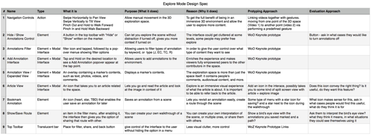
After a brainstorming session, we came up with a design spec of features that we wanted the prototype to have, our reasons for having that feature, how that feature would look in the prototype, and how we would evaluate that feature.
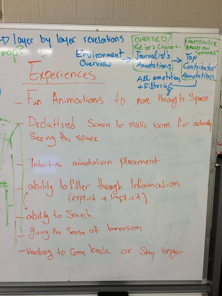
Feedback we received on certain aspects of our prototype caused us to redesign, scrap, or add to the prototype. Specifically, we abandoned the “click wheel” we had designed for navigating the 3D environment, redesigned the types of interactions and filters available with the various forms of media (audio, images, video, and comments) in our design, and developed a concept for viewing an overview of the environment, as well as bookmarking markers in the environment. In thinking about how to create the experience of these changes, we went back to our design principles of a sense of immersion, intuitive navigation, and the ability to easily search for content.
Navigation
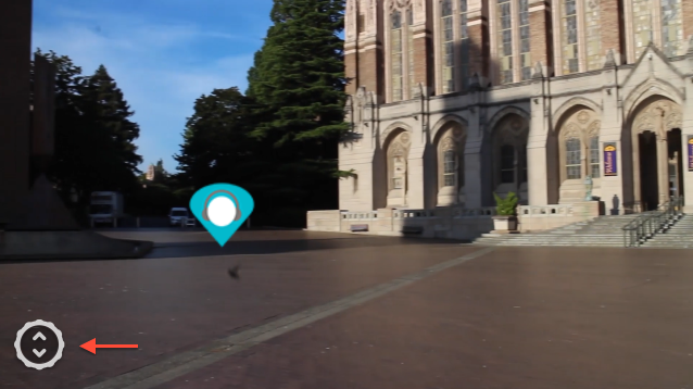
In place of the click wheel, we chose to have users navigate the space using gestures we had chosen, based upon our assumptions of intuitive navigation. These gestures were swiping left or right to pan left or right in the space, swiping up or down to tilt the view and look upward or downward, and pinching outwards to walk forward in the space.
New Concepts
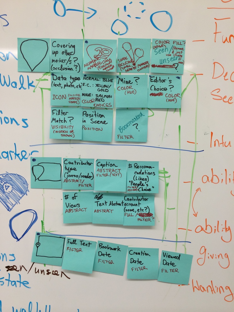
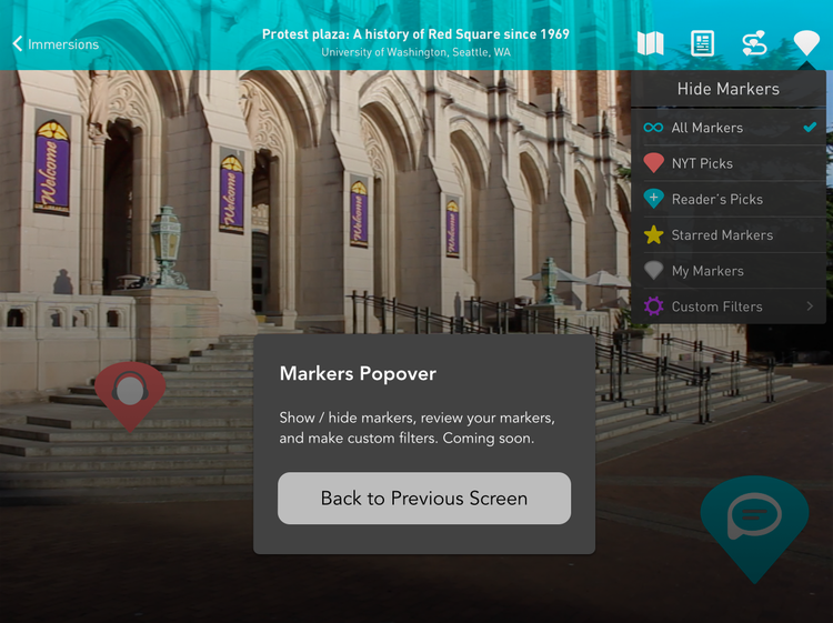
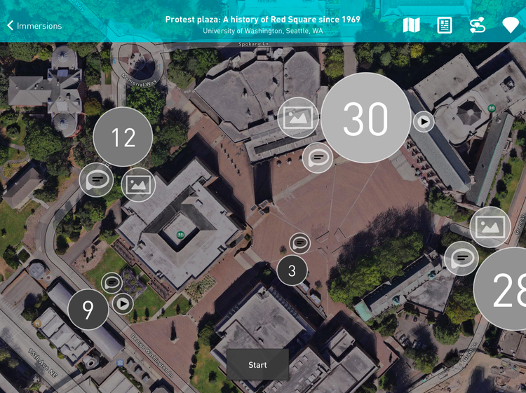
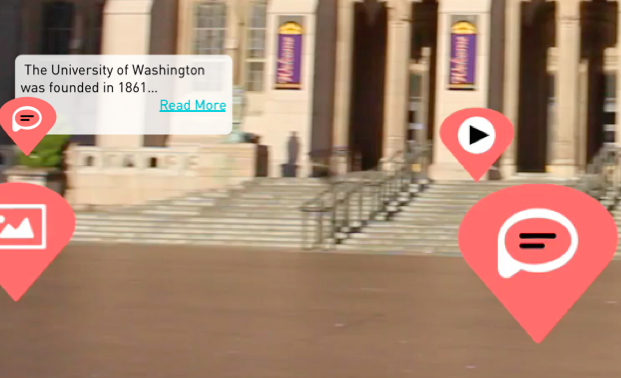
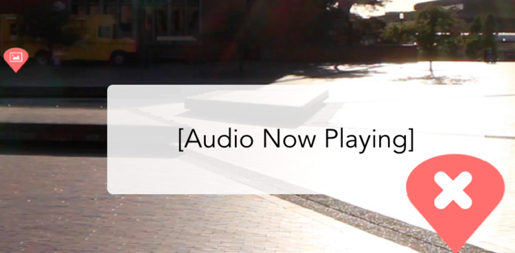
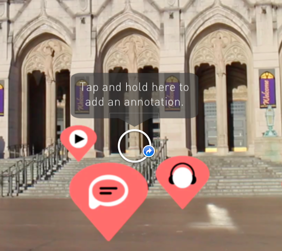
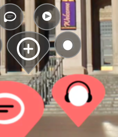
For interactions with the markers, we decided to call out the curated, editor’s pick markers and markers contributed by readers through differences in color. We also developed an interface for filtering these markers based on media type and contribution type—editors, readers, and your own markers.
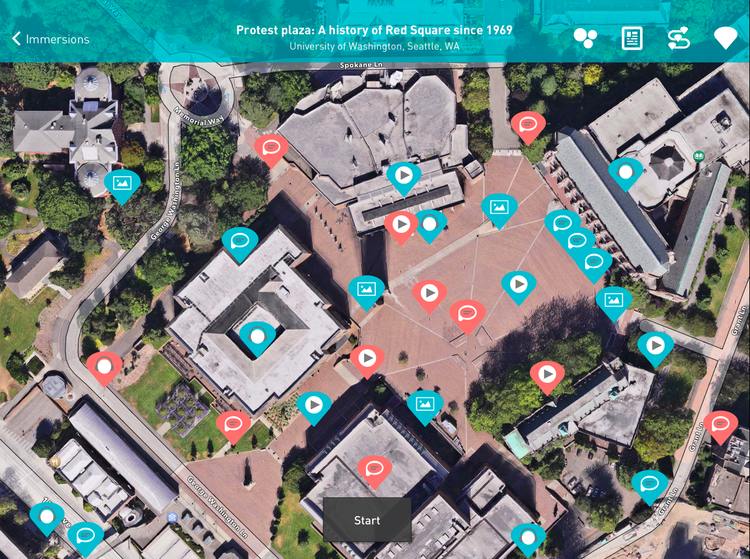
We also came up with a new concept for the explore interface that really excited us. We had always thought about including the ability to bookmark markers in the environment, but we started thinking more about what you could do with these bookmarks. In the end, we felt it could be a type of curation similar to the initial view of the space, which shows only the markers created by the journalist. Your bookmarked markers could serve as your own guided tour of the environment, that you could use for your own reference or share with others.
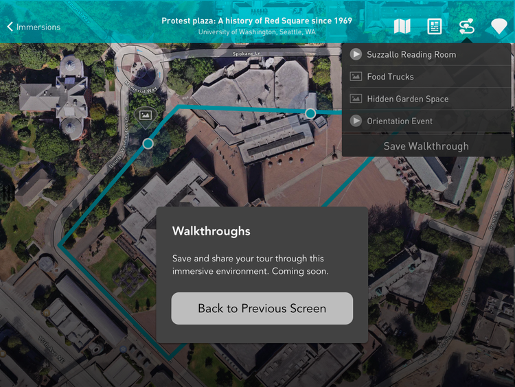
We also thought it would be interesting for publishers and readers alike to see what spaces of an environment had been most contributed to, in the form of a heat map of markers over an aerial view of the environment. This became the first view of the space the user would see after finding the environment, and also led us to develop an interaction that allowed the user to slowly “fly down” from the aerial view and see a little more of the space before starting their walkthrough.
Deciding What to Test
We had another brainstorming on all of the features that we were unsure about in our prototype, as well as overarching questions about the experience, based on our design principles.
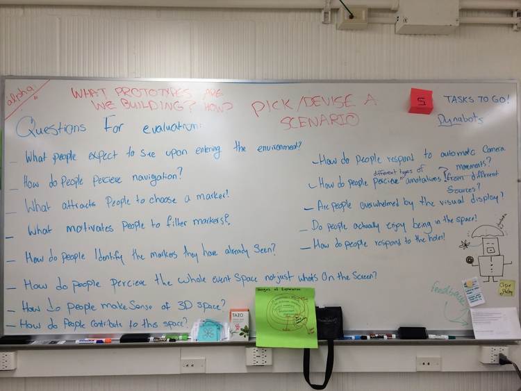
We then voted on the questions we were most interested in, and came up with five that we would evaluate with participants. These included ways of navigating, how people made sense of a 3D space, how people would contribute to the space, and what people thought of our visual interface and icon design.
Recruiting Participants
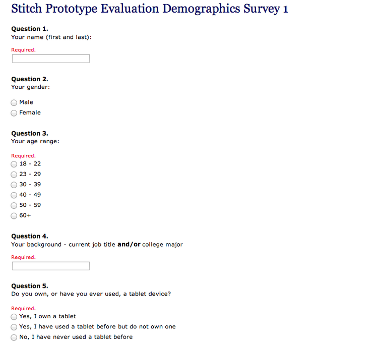
We chose to reach out to the DUB mailing list at the University of Washington, as well as a UW group on Facebook, because we felt that our target audience would include a wide range of people. We also created a screener survey to discover user’s news reading habits, familiarity with tablets, familiarity with 3D environments, and demographics information. As we sent out our requests for participants, we gave a little background on our project focus and what we were trying to accomplish.
Thankfully, we received a lot of interest in our project, and so had a lot of potential participants to choose from. In the end, we tested our prototype with 2 males and 2 females, age range 18-39, from a variety of majors: English, biochemistry, geology, and prospective informatics. All participants read the news fairly often, had at least some experience with a tablet, and a small amount of experience with 3D environments.
Testing Approach
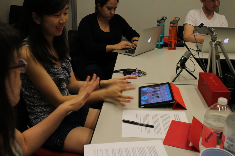
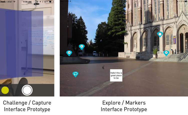
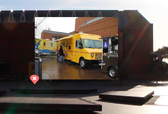
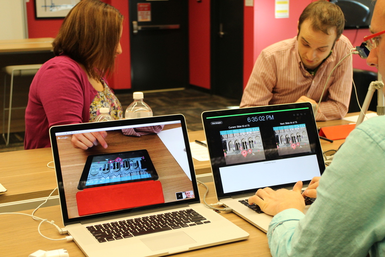
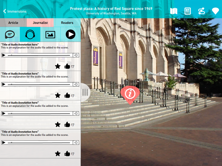
#### Behavioral Prototype Because this is a newer interaction model in terms of 3D environments and touch gestures, we wanted to know how people would like to move around this environment and what they considered important within the environment. Therefore, we chose to have participants evaluate a behavioral prototype. The prototype consisted of an interactive prototype comprised of stills, video, and motion graphics, linked together using Keynote. This interactive prototype simulated a 3D environment participants could explore, which in this case was Red Square at the University of Washington, as we could easily take photos and videos to include in the prototype. Because this was a behavioral prototype, we had a set of pre-determined tasks the user needed to accomplish, as well as certain areas of Red Square they would see, based on the video we had captured.
Card Sort
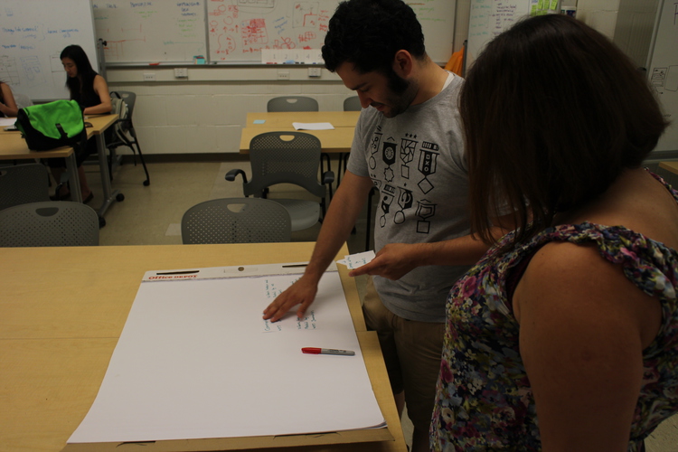
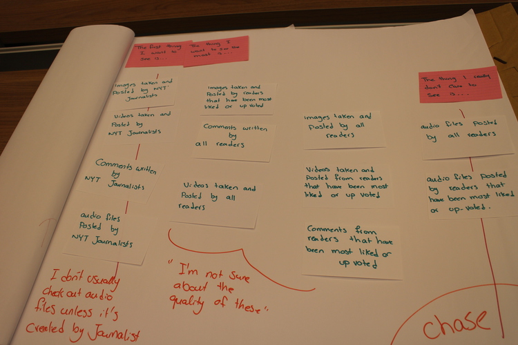
We had specific questions about how the markers were shown in the environment, in terms of media type and contribution type. Our interface had a series of filters the user could use to pick what types of markers they wanted to see, but we also wanted to know what types of markers and contributions seemed to generally be most important to the users. In this way, we could determine what types of markers to show in the default view. In order to test this, we performed a card sort exercise with four people. There were 12 cards total, the four media types and contributor type of journalist, other readers, self. The participants were asked to put the cards in order of what they deemed most important, and we then asked some follow-up questions about their choices.
Testing Script
In terms of the general questions we had about our prototype, we thought about navigating the 3D space and evaluating how the user would try to navigate the space versus the gestures we had chosen. We also wanted to measure the clarity of our icon meanings for various media types, as well as how to navigate back to the article that the 3D environment is related to. We also had questions about the clarity and types of filters for exploring the markers in the environment, and the ease in which the user could contribute their own marker to the space. Because there were a limited number of tasks that could be accomplished through this prototype, and a high chance of something happening that we did not intend in terms of the user trying something out of order, we first showed the user a scene in the prototype and asked them to tell us what they expected to happen in the scene, what they expected to be able to do based on what they saw in the environment. Then, we asked them to perform specific gestures or tasks, ensuring for the most part that the prototype would not break. These tasks included showing us how they would find an article about red square, enter the environment from aerial view. move left, right, up, down, and forward, to find a specific audio file, identifying the other types of media, identify contributor types, express a preference for contributor, filter them, add their own marker to the scene, and return to the article view.
Testing Environment
We chose to do our testing in the Allen Research Commons in a private room when possible, as well as in the MHCI+D studio. We had one facilitator sit next to the participant, who tested our prototype on an iPad. One team member operated a video camera on a tripod across the room from the participant to record body language and facial expressions, and a small camera on the tabletop recorded the iPad screen and hand gestures of the participant. A small microphone was also placed next to the participants. Another team member sat off to the side, controlling the prototype transitions through Keynote. The remaining two participants acted as notetakers, one recording dialogue and actions, and the other recording facial expressions and body language. This would help to discover the participant’s possible real reactions to what they were asked, rather than relying solely on what they told us.
Our Findings
There were both positives and negatives to our findings. For instance, our media icons were understandable, but our toolbar icons were only understandable to about half the participants at first sight. Once participants tapped the icons, however, the purpose of the icons became clear. We also gained some very interesting insights into how our participants wanted to navigate and how they viewed marker placement. The act of “walking forward” was split between participants first wanting to swipe downward, and participants who first wanted to pinch out as we had intended. However, all participants seemed to have more of a notion of “zooming in” rather than walking through a space. They all expressed a wish to double tap a location to instantly move there, rather than having to move forward over time. This was most apparent as the participants saw the aerial view of the environment, and is an idea that we might like to implement in future.
The placement of the markers was also very important. For instance, one of the comment icons was arbitrarily placed in a part of the environment that had two people standing together, and at least half of the participants thought the comment icon had something to do with a conversation between the two people. Because the markers also have a pointed bottom, most participants expected, understandably, that the marker would relate directly to what was underneath it, even when we had chosen a location arbitrarily. Participants also thought the visual layout was overwhelming or cluttered when both journalist and reader contributions were shown, and one of the participants expressed a wish that the markers were grouped very specifically by landmark, and possibly aggregated. For the second group of participants, we now explored the possibility of having only four markers for each landmark, with each marker expanding to include a list of all contributions of that media type for easier browsing. During the test, we showed them both the original markers and filters view, and our updated version second. The aggregate view was preferable to that group of users, because it reduced visual clutter.
We also discovered that participants were optimistic about the ability to save the markers. One participant said she would use it to plan a route through an unfamiliar area, while another wanted to use it as a record of where he had already visited in the environment, or areas of the environment he would like to explore later.
Next Steps
For future iterations of this prototype, we plan to make a version using the Unity 3D game engine. We believe this prototype would deliver an experience closer to the envisioned final product, as it would solve the lag and limited navigation shortcomings of our current behavioral prototype. We are also looking into how to aggregate contributions by media type, and how to best display these “aggregate markers”. Finally, we are looking into adding a “tap to move forward” navigation model that lets people tap a location to move there in addition to the touch gestures we already modeled.