
Diving into interface design and prototyping has been a long time coming. After separating our system into discrete components, we started planning, sketching, and writing design guidelines for each part of Stitch. Stitch’s most unique features are crowdsourced capture of newsworthy locations and immersive exploration of these spaces, so our prototype work focused closely on these two components.
The Capture Experience
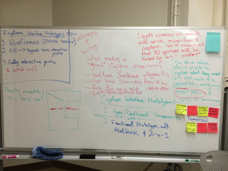
Early on, we started thinking about the capture experience for Stitch, since a poor experience with this interface could prevent people from even participating in the collaborative work required to build these immersive, annotated exploration spaces we had in mind. Our first question about capture was simply, “how will we actually direct people to capture the environment?” There were many more questions about capture embedded into this one, including:
- How do current 2D and 3D capture interfaces work? What makes a “good” capture experience?
- What is the conceptual model behind the capture experience? How will we reflect this in our interface to create an accurate mental model?
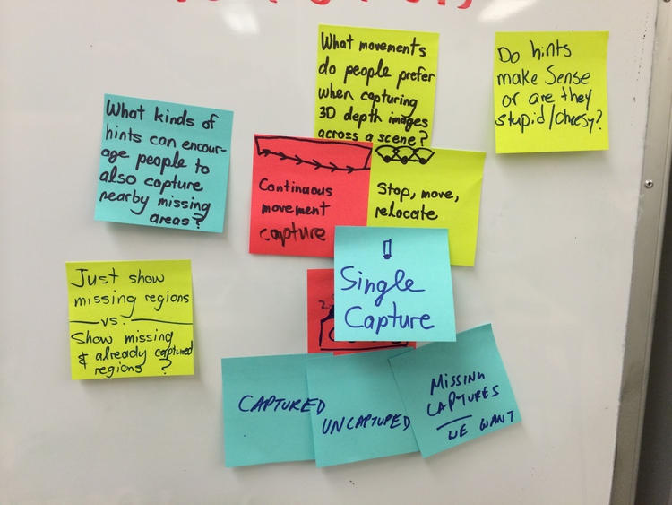
- How can we direct or encourage people to capture certain portions of a scene that haven’t been captured yet?
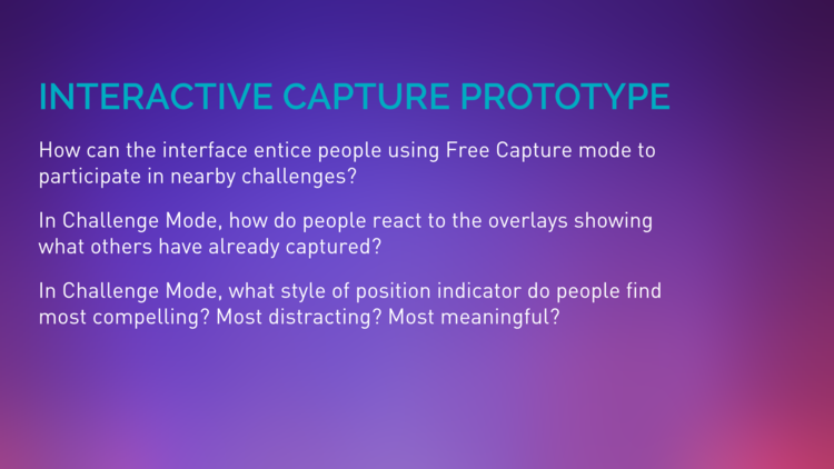
- How do we balance directed capture with “free capture” to make sure the system has both individual and communal value for people?
- What visual appearance should hints and other interface elements have?
We looked at several existing interfaces, including panorama stitching tools like the iOS Camera app, Google Photo Sphere, the Photosynth panorama app for iOS, and more. After further discussing the paradigm to use for our capture interface based on existing approaches for depth capture (KinectFusion, Project Tango), we decided to go with a “multiple single-shot” approach, as it felt like a familiar balance between depth capture and taking a standard photo.
Pinning Down Our Prototype Ambitions
We eagerly started whiteboarding our interface designs and questions, but before long, we needed to very specifically define which prototypes we were actually building, at what level of fidelity, answering which questions. We had even started creating some prototypes, but their direction and purpose were lacking and unclear as a whole group. Hence, we created two frameworks: a Prototype Inventory and a Capture UI Variables summary.
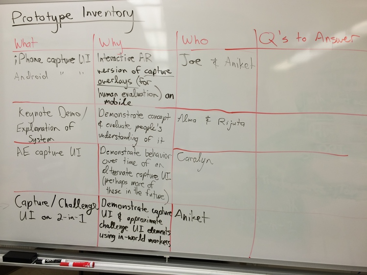
The Prototype Inventory listed each of our currently planned prototypes and the motivation behind creating them.
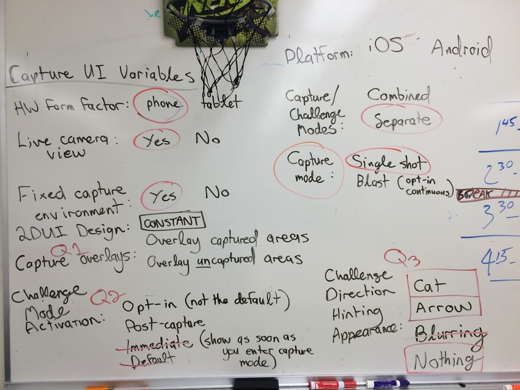
The Capture UI Variables framework came out of a discussion that revealed differing opinions on why and how to prototype the capture UI. We used this framework to pin down consistent elements and specifically target specific questions by varying certain parts.
Explaining Stitch Efficiently with a Video Prototype
We took some time to create a unique one-off prototype: a compact video prototype of Stitch, which defines and explains the system through words and graphics. We created this explanation to help people better grasp the core concepts of the system. Our previous storyboard videos were successful in this regard, so this shorter video aimed to tighten up and compact the storytelling from those, providing a quick, solid, and accessible introduction to Stitch.
Prototyping for Mobile First
For the rest of our specific interfaces, we made the important decision to start prototyping mobile phone interfaces first. Our belief was that these mobile interfaces should contain the minimum functionality required to realize our desired experience, and from there we could expand those interfaces to accommodate larger screens.
The Explore Interface: Focus on Navigation Controls
The second tent pole of the Stitch is immersive exploration of a location and content embedded within the space in virtual reality. We thus started conceptualizing and prototyping this component as well, once we had made progress with our capture prototypes.
We considered navigation controls to be the most challenging part of the explore interface. There were a few reasons for this: one, we had many different movement control paradigms to choose from, many of which come from first-person video gaming on multiple platforms. We wanted this interface to be approachable for people who weren’t necessarily gamers, and we also want to navigation controls that best supported exploration of a real-world space. Early on we looked at the movement controls used in Epic Games’ Epic Citadel for iPad, an Unreal Engine demo with a first-person camera view and “dual analog” movement controls, implemented as on-screen thumb sticks.
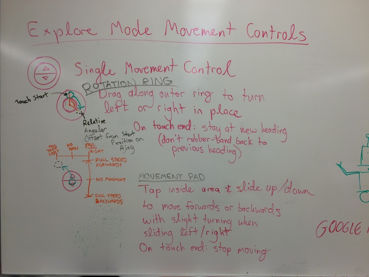
We chose to prototype navigation controls which optimized certain types of movements. Two of the controls appear on-screen, while one is purely gestural, meant for capitative touch screens.
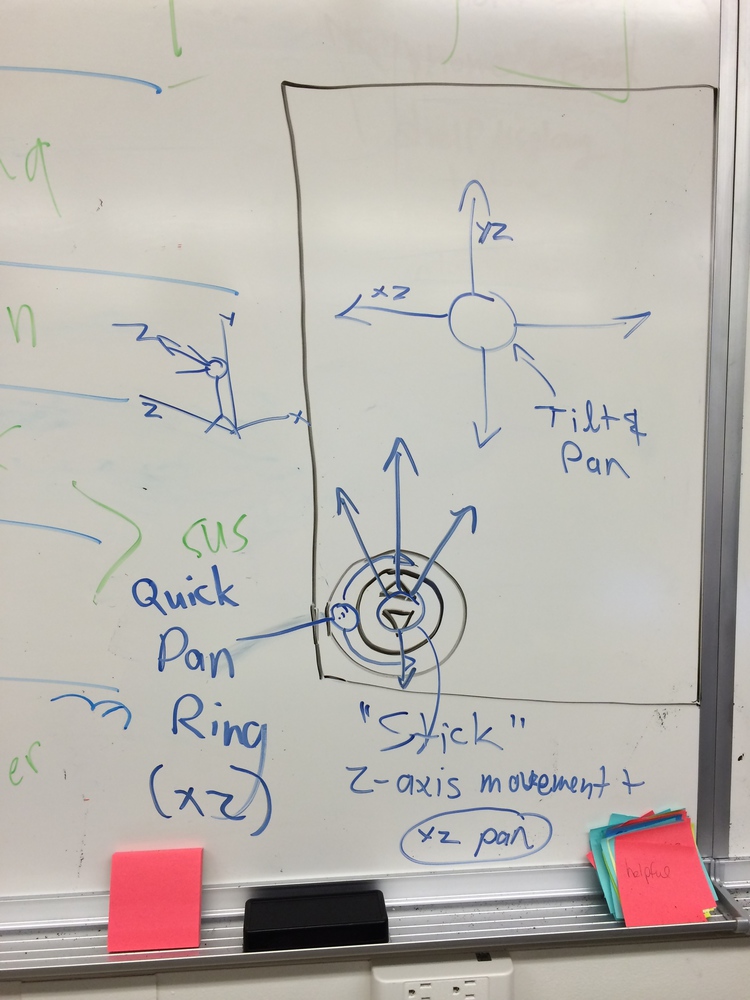
- Flick and swipe anywhere on-screen to pan and tilt. This control supports stationary surveying of a scene, as when looking at a building facade, for example.
- A quick pan ring for rapid panning. This control supports quickly turning around in-place when tapping and dragging along the outside of a circular control on-screen.
- A stick for forward movement and panning while walking. Inspired by the video game Metroid Prime, this “analog stick” supports tapping and dragging upwards to walk forward, just like the left stick in a standard “dual analog” configuration. Unlike the latter, however, horizontal movement while using our control maps to panning instead of strafing (walking sideways). This change allows the control to support forward movement with banking, as when walking down a curved corridor.
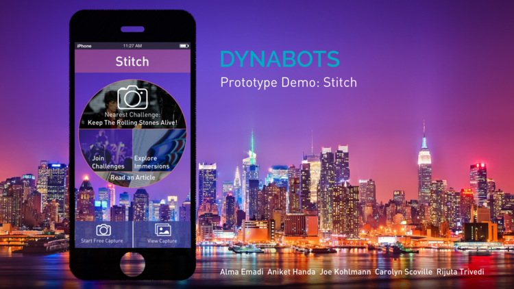
Realizing a More Cohesive Experience with the Stitch Mobile App
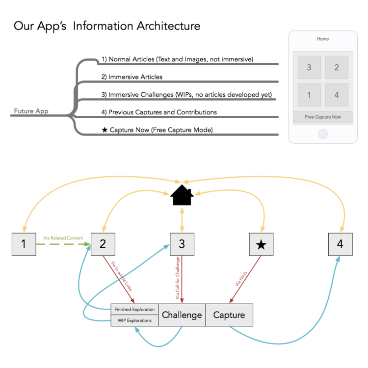
As we started building up these two different interfaces, capture and explore, we realized the need to fit them into a single, cohesive information architecture. Given our familiarity with Apple mobile devices, we chose to fit the interfaces into a mobile app paradigm. We envisioned an app which brought together several pieces of content:
- A publisher’s regular news articles
- News articles attached with completed immersive spaces
- Motivating “capture challenges” soliciting people’s help in capturing and completing work-in-progress scenes
- A “Free Capture” mode to support the creation of personal depth captures
- A list of previous personal captures
Dividing and Conquering (Again and Again)
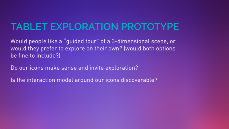
We chose to conceptualize a whole system: not a series of discrete components, but a full system, with Stitch. This choice made it difficult to scope down our prototyping ambitions. At one point, we were going to make two interactive capture interface prototypes and several explore interface prototypes using static and motion graphics. We also had begun to consider a tablet interface in addition to the smaller mobile phone interface.
Dividing our efforts like this shouldn’t have meant uncoordinating them, however, so we reached a point where we had to refocus: what prototypes were we building, and what did those prototypes help us evaluate? We realized we couldn’t just test the individual interface components out of context, so we started to approach our prototyping goals through a more coherent vision. At one point we discussed integrating all our prototype components into a single app to test with. Ultimately this was the right approach for many reasons, but time didn’t permit it—so what did we do?
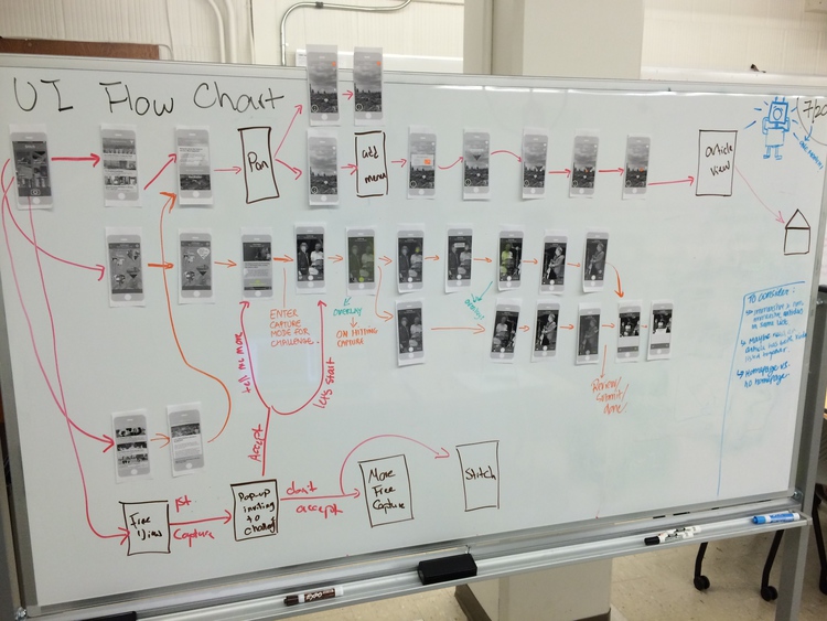
We reorganized our prototypes by interface and by medium, which is shown in the whiteboard photo below.
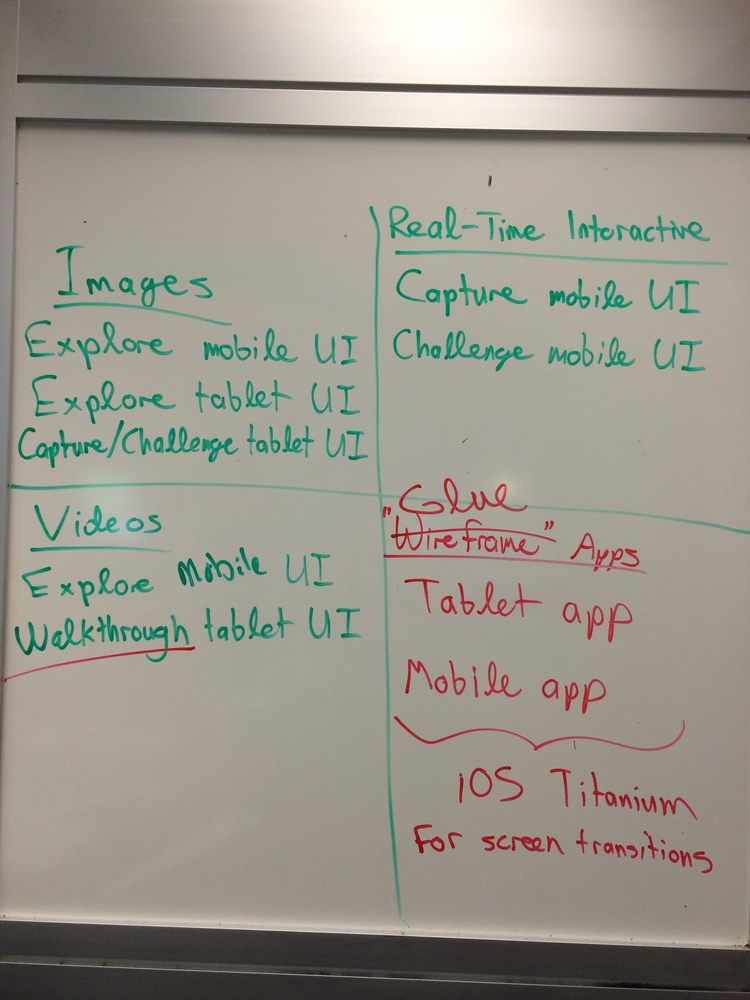
The plan was to have three levels of fidelity—images, videos, and real-time interactive graphics—and to “glue” these pieces together with two “wireframe” apps, one for mobile phones and another for tablets. This unified approach meant scrapping our second interactive capture prototype and buckling down on app interface design to make a coherent experience. This approach also included the use of motion graphics to prototype the look and feel of immersive walkthroughs on tablets, which had been planned for a while, but had gotten lost in the flurry of interest around capture UI prototyping.
Prototype Deliverables
We gave ourselves a tremendous amount of work and a high bar for completeness, so how’d we end up doing? On Monday we presented three prototypes:
- A comprehensive Stitch mobile app interface prototype, including static mockups of the capture and challenge UIs, as well as some visual variations to more prominently emphasize challenge and capture.
- A separate interactive Capture / Challenge UI prototype.
- A tablet interface prototype with static, motion, and basic interactive mockups of what scene annotations and navigation might look like.
We ended up getting pretty close to our production goals for prototyping, though some parts didn’t quite come together as smoothly as we would’ve hoped. Everyone on the team ended up directly contributing prototype materials, so instead of having a bottleneck of a single visual designer on the team, our bottleneck was instead the work needed to coordinate and bring together everybody’s pieces.
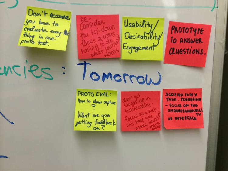
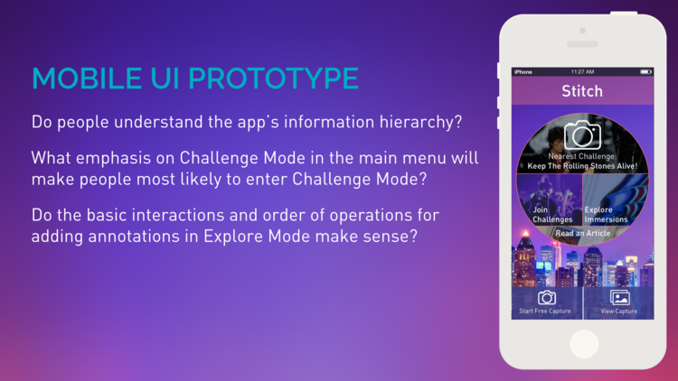
Our Prototype Evaluation Strategy
In the end, our prototypes exist to help us answer questions, so the next step is to evaluate the prototypes according to a series of concrete evaluation questions. We have much more work ahead of us to perform formal evaluations with these prototypes, but the sets of questions below set our trajectory.
We gained invaluable insight into these designs almost immediately, thanks to another meeting with Vince Ball from Nytec. Vince helped us work through some very different possibilities for the explore interface’s navigation controls, as well as some other options for the app’s information architecture. Conversations like these are what will help us iterate on our prototype designs with clear purpose and urgency.
Similarly, a piece of feedback that emerged from our discussions with our mentors and instructors was the importance of Stitch’s explore interface. While capture remains important, there are potentially multiple ways to capture these immersive 3-D scenes, making exploration and annotation of the environment the most novel and accessible features of the system. In light of this feedback and our short project development schedule, we realize we need to quickly iterate on our explore interface prototype to improve our ability to evaluate it.
Hence, our goals for prototype evaluation are thus focused on three things right now:
- Iterating on our explore interface with a slightly higher level of interactivity to improve our ability to evaluate it.
- Taking the prototype out into the world to perform usability evaluations with everyday people who might end up using the app.
- Examining the prototypes in detail through heuristic evaluation, with the help of our project mentors.
The big takeaway: stay tuned for (much) more on exploration.