
Activity and Process
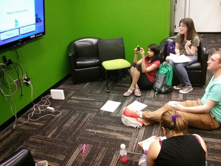
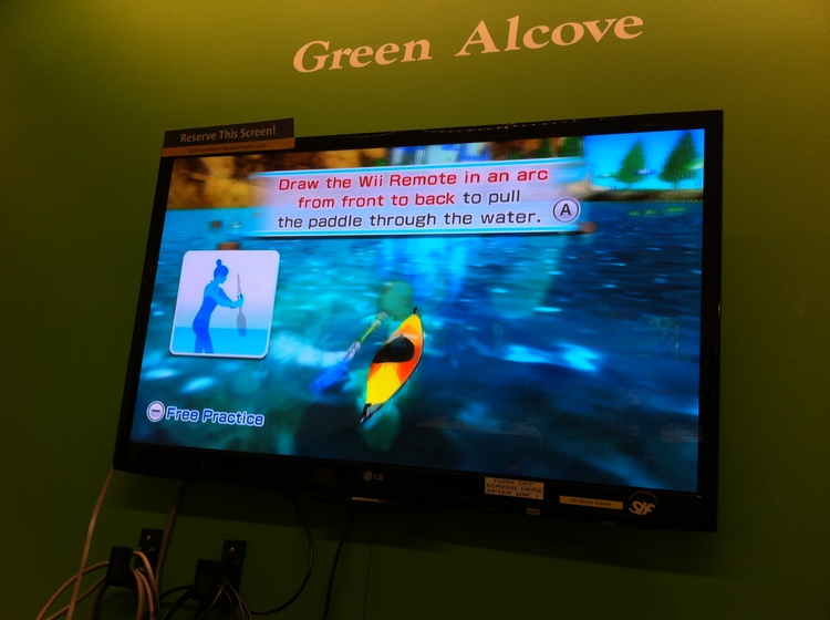
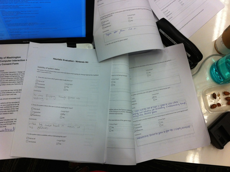
In order to better understand a generally well-regarded area of the current gesture technology product space, we chose to do a heuristic evaluation, or expert usability test, of the Wii system and a specific game, Wii Sports Resort. In keeping with best practices,we chose to follow Nielsen’s Ten Standards of Usability Heuristics, but also added metrics that we felt were specifically relevant to gameplay. We created a paper form that we could use to keep track of interface problems, heuristic violations, and other notes about the experience of the interface. We also rated the problems with regards to the severity of the violation. When evaluating the interface, we went through every aspect of the generic Wii menu that we could find, the Wii Sports Resort menu, and a few more Wii apps and Sports Resort games in addition to the games we were evaluating in the usability test.
Key Observations and Takeaway
Though we found the inclusion of specific gameplay metrics to be useful, these metrics also made it harder to evaluate the interface based on problems alone, because we were looking for specific gameplay violations rather than categorizing the problems we found under certain heuristics. However, we did learn firsthand the value of conducting both heuristic evaluations and usability tests with end users, because it enabled us to spot the differences in the user experience for people like ourselves who are very familiar with that interface type, versus novice users. More specifically, there were cases where features that we thought were well-designed and obvious were in fact not obvious to people outside of our research group. Hence, underlining the need for combining heuristic analysis with a usability study.
Implications for Design and Moving Forward
Though many of our metrics were specific to the gaming world, we realized that some of these metrics could still be applied to any gesture-based interface. These metrics included the ability to pause a current action, the ability to go backwards through menu levels easily, and the ability to exit a program whenever the user wishes. The results of this evaluation have caused us to think about what heuristics would be most valuable in the evaluation of a 3D setting, and which actions would be essential to a gesture-based interaction model. Completing this evaluation has also given us a foundation for how we might go about finding the most essential visuals and tasks that a user might need for a gesture-based interface, and how to evaluate them.
Heuristic Evaluation of Flipboard
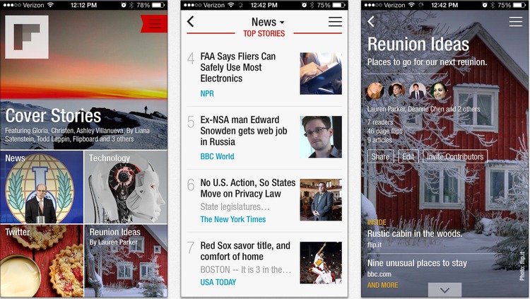
Exercise Summary We chose to do a heuristic evaluation of the app Flipboard, because it is a relatively popular news consumption platform. We started the evaluation on a Windows tablet, and then switched to an Android tablet and an Android smartphone to find out if there were platform differences.
Reflections on this Technique
As this was our second heuristic evaluation, we were able to take what we had learned from the Wii heuristic evaluation and apply it to this exercise. Specifically, this involved finding problems first and categorizing them later, rather than looking for specific metrics. What was challenging with this technique was deciding which heuristics a problem violated. This was occasionally resolved by deciding that a problem violated more than one heuristic. However, an unexpected benefit of this exercise was discovering the value of testing an interface on more than one platform when possible. Through testing the app on both a Windows and Android platform, we were able to discover interface inconsistencies that may not have been found if we had only looked at one platform.
Reflections on our Design Process
The main insight we discovered was that the aggregation app suffered from a common problem with aggregation: pulling from multiple sites increases the likelihood of inconsistent and confusing formats between articles. Therefore, we now want to research other aggregation sites to see how others are tackling the inconsistency problem, so that our designs don’t run into the same problem. In general, we learned that it is a good idea to evaluate not only popular interfaces, but also unique and innovative interfaces for design inspiration.
Media Needed: Photos from Research Summary deliverable 6-06 Flipboard Heuristic Analysis screenshot (Research)