

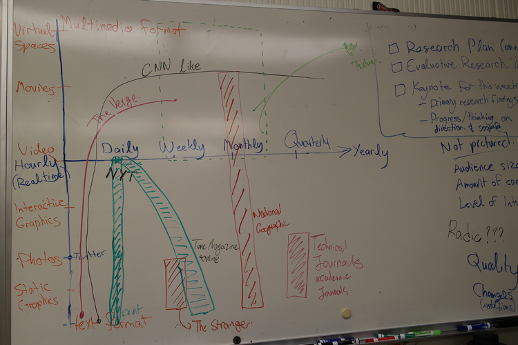
Activity and Process
While researching the publishing industry for our capstone project, we started thinking:
Okay, we know about all these different publishers, from newspapers to cable networks, but what different kinds of media are they producing, and at what frequency? Weekly? Daily? Hourly? What’s that space look like, and where are there gaps? Where do we think we can contribute?
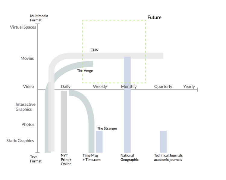
Mapping our knowledge of the publishing industry proved to be a challenge, especially as we constructed two different axes for our visualization. We’d been thinking a lot about present and future content experiences a while before, so we developed a vertical “media type” axis with different “notches” corresponding to content such as text, photos, static graphics, all the way up to multimedia such as video, movies, and even virtual reality environments.
From there, the horizontal axis fell into place: we realized it should represent “publishing frequency”. Together the two axes let us visually represent a wide range of content, from hourly Twitter posts, to weekly magazine issues, to yearly documentary productions.
Here’s where the chart started getting a little crazy: no one publishing company really has a single niche in this space anymore! Even a “traditional” publisher like The New York Times has a web presence with blogs and video content, for example. Hence, we drew a handful of publishers on the chart as “ribbons” to depict the range of content types and publishing frequencies they typically cover.
There are several dimensions that we couldn’t cover in this visualization, such as audience size, the amount of content produced, and level of interactivity. In the end, that’s the joy and sorrow of research frameworks: you can’t always account for every force in the world, but you can make sense of a few key influences, at least.
Without further adieu, then, let’s just present the final chart and see what you make of it:
Key Findings and Takeaways
As shown in the diagram, media organizations such as CNN, which indeed started life as a then-novel “cable news network”, have expanded both their format and frequency coverage over the years, sometimes in a “downward” fashion, chasing the high-frequency text content area of the space. This expansion gives the organization and the brand the ability to operate in a “continuous” nature across different media types. Expansion also gives publishers a measure of resilience against adverse market changes, such as the slowly looming and long-foretold death of print media, as NYT and Time have realized.
Implications for Design and Moving Forward
Anyway, where are the gaps in this space? The “low-fidelity”, high-frequency corner of the chart is pretty crowded, but there might be some headroom up in the “Future” box—an area representing interactive, immersive multimedia content, published on a less frequent schedule. Content like this would probably take more time and money to produce, but there are organizations with the resources and editorial interest in such a space, such as National Geographic.
We need to explore and interview more to investigate the potential in this space, but the use of our own wild ideas for a visualization framework proved to be very useful indeed.
Furthermore, we can use this activity, which in essence was a distant observation activity of what’s currently being produced out there, to further narrow down our project scope. We now know that our target publication modality should be those with frequencies closer to weekly and monthly editions and content types that are more expository or exploratory in nature.